Rayon
Wherever the journey begins

Role: Product Designer (UI/UX)
Platform: Web (Desktop + Responsive)
Industry: Travel & Tourism
Overview
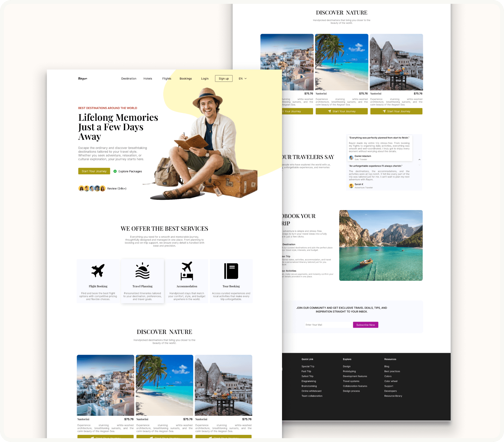
Rayon is a travel booking web platform designed to take users from wanderlust to confirmed trip across four core services: flight booking, travel planning, accommodation, and tour booking. As the lead designer, I was responsible for the full UI/UX of the landing and booking experience; from the hero section through destination discovery, service offerings, social proof, and the booking onboarding flow. The challenge was to make a platform that competes in a saturated travel market feel distinctive, trustworthy, and genuinely inspiring, rather than another generic aggregator.
The Goal
The primary goal was to design a web experience that converts browsers into bookers; reducing the gap between "I want to travel" and "I've started planning" to as few steps and as little friction as possible. Secondary goals included building credibility through social proof and transparent service communication, and creating a visual identity warm and aspirational enough to make users feel emotionally connected to the destinations before they even clicked through to a listing.
The Problem
Most travel booking platforms fall into one of two traps: they either prioritise comprehensiveness over clarity; surfacing so many options, filters, and price variables that users feel overwhelmed; or they lean so heavily on stock-photo glamour that the platform feels untrustworthy and impersonal. Neither builds the kind of confidence a user needs to hand over payment details for a multi-day trip.
There was also a structural problem specific to multi-service travel platforms: how do you present flight booking, accommodation, travel planning, and tours; four genuinely different service types with different decision-making processes; without making the homepage feel like four separate apps stitched together? Users arriving from search or social often have only a vague intent ("I want to go somewhere warm") and the platform needed to serve both that exploratory mindset and the more focused user ready to book a specific flight.
The Solution
Rayon is structured around a clear narrative arc: inspire first, inform second, convert third.
The hero section leads with emotion; a bold headline ("Lifelong Memories Just a Few Days Away"), an approachable traveller figure, and two differentiated CTAs ("Start Your Journey" for the ready-to-book user and "Explore Packages" for the browser), so the platform immediately speaks to both user intents without asking them to self-identify through a filter or dropdown.
The services section names the four core offerings clearly (Flight Booking, Travel Planning, Accommodation, Tour Booking) with brief, benefit-led descriptions, positioned before destination content so users understand the platform's capability before they get emotionally attached to a specific destination.
The "Discover Nature" destinations section uses full-bleed photography cards with pricing surfaced on the card rather than locked behind a click; because showing price upfront removes the hesitation of "but how much does it actually cost?" that commonly kills exploration. Each card carries a clear "Start Your Journey" CTA that keeps the conversion path present throughout scrolling.
Social proof is handled through a dedicated testimonials section with named, avatar-accompanied reviews, reinforcing trust at the moment between browsing and committing. The "How To Book Your Next Trip" section demystifies the process with a three-step flow (Choose Destination - Customize Your Trip - Customize Activities), reducing the perceived complexity of multi-service booking. A newsletter subscription section at the footer captures users not yet ready to book, creating a re-engagement channel.
The Design Approach
I structured the design process around two foundational questions: what does a first-time visitor need to feel confident enough to start planning, and what does a returning visitor with a specific trip in mind need to complete a booking quickly?
The process began with competitive analysis of established travel platforms; examining where their information hierarchies broke down, where social proof was either absent or visually underweighted, and where over-filtered search interfaces created decision fatigue. From that analysis I identified three patterns to deliberately avoid: generic hero CTAs that don't differentiate user intent, destination content without upfront pricing, and booking flows that felt like form-filling rather than trip-planning.
I built the page architecture around a scroll narrative rather than a feature inventory; each section earns its place by either building trust, deepening intent, or lowering a conversion barrier, rather than simply listing what the platform can do. Wireframes were tested at low fidelity against both user intents (explorer vs. ready-to-book) before visual design was introduced, ensuring the hierarchy worked independently of photography and colour.
The component system was built for scalability: destination cards, service tiles, testimonial blocks, and step-indicators were all designed as reusable components so the platform could expand to additional destinations and service types without visual inconsistency.
Visual Direction
The visual language of Rayon is warm, confident, and travel-editorial in feel — closer to a well-designed travel magazine than a typical booking engine.
The palette pairs a clean white canvas with an earthy olive/khaki accent (used for primary CTAs, labels, and active states) and a warm yellow-cream used for the hero background circle, grounding the brand in the warm tones of travel; sunshine, sand, open skies; without defaulting to the overused teal-and-white of most travel brands. The accent colour choice is deliberate: olive reads as considered and adventurous rather than corporate, setting a personality that matches the aspiration of independent travel.
Typography uses a strong serif or high-contrast display weight for hero headlines ("Lifelong Memories Just a Few Days Away") creating gravitas and memorability, while body and UI copy stays clean and highly legible in a neutral sans-serif. The combination gives the platform a dual register: editorial and inspiring in headlines, clear and functional in navigation and service copy.
Destination photography is presented at generous sizes; full-bleed cards in the Discover section, a large scenic image in the booking flow explainer; because travel is an inherently visual category and undersized imagery undermines the emotional selling work the platform needs to do. Avatar stacks in the hero (showing review contributors) and named testimonials with profile photos in the social proof section add human presence throughout, counteracting the impersonal feel common to large travel aggregators.
Navigation is minimal and functional — Destination, Hotels, Flights, Bookings, Login, Sign Up — keeping the header clean enough to not compete with hero content while maintaining clear wayfinding.
Key Sections & Design Decisions
Hero — Dual CTA architecture (Start Your Journey / Explore Packages) serves both user intents from the first scroll position. Review count (34k+) with avatar stack establishes social proof before any product content is shown.
Services Grid — Four-column service tile layout with icon, name, and one-line benefit description. Travel Planning tile is visually elevated (card treatment vs. flat tile) to signal it as the platform's primary differentiator beyond simple flight search.
Discover Nature — Full-bleed destination cards with visible pricing. "Start Your Journey" CTA on each card maintains conversion path without requiring a return to the hero.
Testimonials — Named reviews with avatar photos and quoted text in a horizontal card layout. Quote text is sized generously to be readable without expanding, maintaining momentum through the section.
How To Book — Three-step visual explainer, with colour-coded step indicators, paired with a scenic destination photograph. Demystifies the platform's multi-service complexity at the point in the scroll where a committed user is deciding whether to proceed.
Newsletter CTA — Clean, minimal email capture section. Positioned to convert users who've engaged with content but aren't ready to book; turning a single-visit browse into a re-engagement touchpoint.
The Outcome
Rayon demonstrates full-page web product design at editorial quality — from a conversion-optimised hero to a trust-building testimonials section and a booking flow explainer that reduces perceived complexity. The design system established across the page is cohesive and scalable, covering destination cards, service tiles, testimonial blocks, step indicators, and navigation in a single visual language. It's the strongest web (as opposed to mobile) case study in my portfolio, and the one I use to demonstrate long-form page narrative, visual hierarchy across scroll depth, and the interplay between editorial design sensibility and conversion-focused UX.
Reflections & Key Takeaways
Rayon pushed me to think carefully about scroll narrative as a design tool — each section has to earn the user's continued attention while moving them progressively closer to a booking intent. The dual CTA in the hero was one of the most considered decisions in the project: resisting the impulse to simplify to a single action in favour of genuinely serving two distinct user mindsets made the conversion architecture more honest and, I'd argue, more effective. If I developed this further, I'd build out the destination detail and checkout flows, since the landing page sets a high visual standard that the subsequent pages would need to maintain.