Swiftpay
Complex financial data, made instantly readable.
Role: Product Designer (UI/UX)
Platform: CRM Finance Dashboard (Web)
Industry: FinTech
Overview
Vaultiq is a CRM and financial management dashboard built for finance professionals, relationship managers and finance teams, who need a single view of client portfolios, transactions, and account health. I designed the dashboard's information architecture and core UI, focused on making dense financial data fast to scan and act on.
The Goal
The goal was to give finance teams one dashboard that replaced the spreadsheets, email threads, and disconnected tools they were stitching together to track client relationships and account performance, something that surfaced what needed attention first, without forcing users to dig through raw data to find it.
The Problem
Finance teams I spoke with were managing client relationships across multiple disconnected systems: a CRM for contact details, a separate finance tool for transaction data, and spreadsheets to fill the gaps between them. That meant no single source of truth, manual reporting that ate hours every week, and risk signals; like an account suddenly going quiet or a payment failing, that were easy to miss until they became a real problem.
The Solution
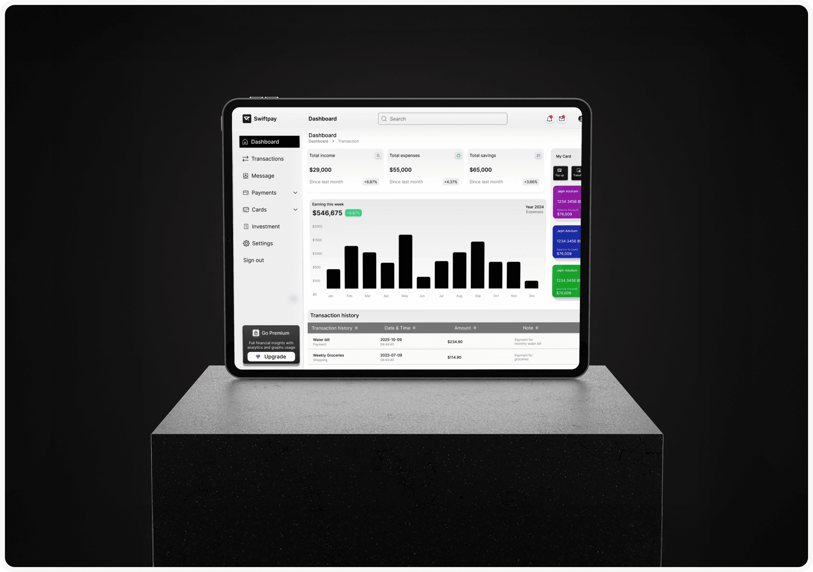
Vaultiq brings client and financial data into one dashboard built around a simple idea: show what needs attention first. A client health indicator surfaces accounts that need a look based on activity and transaction patterns, customizable widgets let different roles prioritize the data that matters to them, and a transaction timeline replaces manual reporting with a live, filterable record. Alerts flag unusual activity directly in context instead of through a separate notification system.
The Design Approach
Because this is a data-dense, desktop-first product, I spent significant time on information architecture before touching any UI; card-sorting exercises with finance professionals helped me understand how they actually grouped and prioritized data, which shaped the dashboard's widget structure. From there, wireframes focused on data hierarchy and progressive disclosure (summary first, detail on demand), and usability testing concentrated on cognitive load: how quickly someone could find the one client or transaction that needed action.
Visual Direction
The visual direction is deliberately restrained; a dark, professional palette of navy and charcoal that's comfortable for long desk sessions, with a small, consistent set of status colors (green, amber, red) doing the work of communicating account health at a glance. Data visualization follows a strict grid and type hierarchy so charts and tables stay legible even when a screen is showing a lot at once; decoration is kept to a minimum so the data itself stays the focus.
Key Features
Customizable, role-based dashboard widgets
Client health scoring based on activity patterns
Live, filterable transaction timeline
In-context alerts for unusual account activity
Exportable reports for offline review
The Outcome
Vaultiq's dashboard gave finance teams a single place to monitor client health instead of reconstructing it manually across tools, and the widget-based architecture made the dashboard flexible enough to support different roles without separate designs for each. It's the project I lean on most when discussing fintech and enterprise dashboard work, since it required balancing density, hierarchy, and clarity at a level consumer apps rarely demand.
Reflections & Key Takeaways
This project sharpened my thinking on progressive disclosure, the instinct to show everything at once is almost always wrong for data-dense products. It also reinforced how much research time dense, professional tools deserve before any screen gets designed, since the wrong information hierarchy is much harder to fix after the fact than a wrong color choice.

