My Work
A selection of interfaces that delivered results
Name:
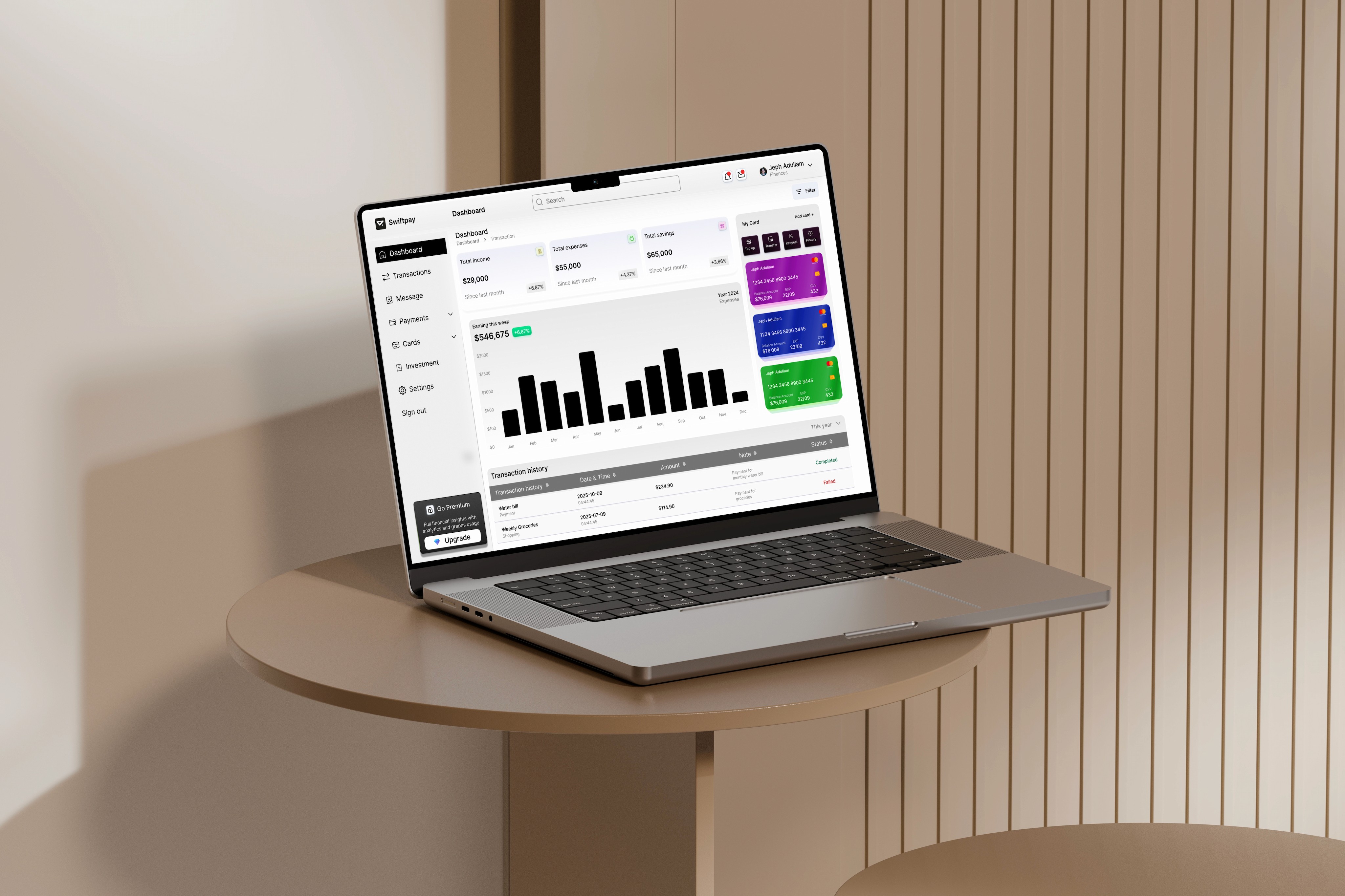
Swiftpay - Making sense of dense financial data
Year:
2025
Role:
Product designer
Overview
Vaultiq is a CRM and financial management dashboard built for finance professionals, relationship managers and finance teams who need a single view of client portfolios, transactions, and account health. I designed the dashboard's information architecture and core UI, focused on making dense financial data fast to scan and act on..
Solution
Vaultiq brings client and financial data into one dashboard built around a simple idea: show what needs attention first. A client health indicator surfaces accounts that need a look based on activity and transaction patterns, customizable widgets let different roles prioritize the data that matters to them, and a transaction timeline replaces manual reporting with a live, filterable record. Alerts flag unusual activity directly in context instead of through a separate notification system.
Design approach
I started with user interviews focused on the last frustrating payment experience each person had, not feature wishlists, but failure moments. Those surfaced where trust broke down emotionally, not just structurally. From there I mapped flows for the five core jobs (send, receive, pay a bill, check a transaction, onboard), wireframed and tested before moving to high fidelity, and built the component library in parallel so every edge case; errors, empty states, loading, was resolved before handoff.
.
Goal
The goal was to give finance teams one dashboard that replaced the spreadsheets, email threads, and disconnected tools they were stitching together to track client relationships and account performance, something that surfaced what needed attention first, without forcing users to dig through raw data to find it.
Problem
Finance teams I spoke with were managing client relationships across multiple disconnected systems: a CRM for contact details, a separate finance tool for transaction data, and spreadsheets to fill the gaps between them. That meant no single source of truth, manual reporting that ate hours every week, and risk signals; like an account suddenly going quiet or a payment failing, that were easy to miss until they became a real problem.
Visual direction
Dark navy background, vivid accent colour, clean white surfaces for data-heavy screens. Typography is geometric and scaled large for amounts; the number you need is always the biggest thing on screen. Micro-interactions add tactile feedback at the moments that matter: transfer success, amount update, loading progress. Nothing decorative that doesn't serve communication.
Outcome
SwiftPay is the fintech case study I reach for most in interviews; it shows payment UX thinking across the full product, from onboarding to transaction history. The transfer flow went from seven steps to three. Fee transparency moved to the right moment. The result is a payment experience built around what users need to feel safe, not just what the product needs to capture.


